- A CreativeNerd's Tribe by Nazish.
- Posts
- The Story of entering the unknown...
The Story of entering the unknown...
Sometimes, you have to walk on the path of unknown to find the missing pieces.
nazish kondkari
July 09, 2025
If you still haven’t read last week's newsletter, then please do. (click here)
This is a continuation of the previous one.
So basically, in January, I shared some of my designs on my art Instagram page.
And, someone from my followers approached me to design a logo for them.
I had always been running away from designing a logo for someone because I could never really design good logos.
But this time I took the chance and accepted the challenge.
I had sent some questions to the client to understand the story behind the brand.
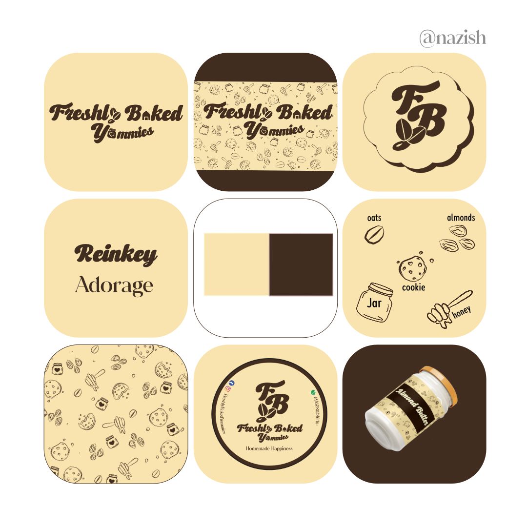
Oh! I forgot to mention, the client was a home-based baker. And, she wanted to design a logo that is simple and doesn’t have any baking elements to it.
So through her answers, I got to know the story behind her baking business.
She often used to bake, and during the lockdown, she began baking more, through which she started getting orders.
Her first item was honey oat cookies, and then she slowly ventured into her products with almond butter and tea time healthy cakes.
She usually baked healthy gluten-free cakes and cookies.
Now, why I mentioned these details here is that they helped me with the whole brand design process.
Let me explain,
Since she didn’t want any baking elements in her logo, I used the fonts and came up with a unique idea.
The letter ‘y’ in the word freshly is designed with the oats symbol.
Although I am aware it looks more like a coffee bean, but its oats since oats are highly used in healthy, gluten-free baking.
The baked has a’ designed as home because the brand is a home-based baking business.
And the yummy word is jar because, be it cookies or butter like the almond butter my clients serve, comes in a jar.
And, the heart inside the jar stands for baking with love.
Why did I choose this color theme?
Because my client was against using food colors in her baking business, she herself is allergic to them and advocates not using them, since they are harmful to everyone’s health.
And, if you see most of the healthy baked cookies or cakes have colors like brown or biscuit cream, that’s why I chose the same.
I learned in a course that fonts also have feelings; they bring out the essence of the brand.
And, so even though at first I wanted to create a handwritten font for this client.
But I ended up using Reinky and Adorage as the fonts for this brand.
I even designed the brand elements and presented a mockup to the client, and she absolutely loved it.
I am proud of myself for taking this chance and not letting it go.
You might think that after this, it was an easy path.
But no! After this, I somehow stumbled into an overthinking process about my own brand.
However, what this taught me was that sometimes you just have to trust the process, believe in yourself, and give it a shot.
You may even fail once, but you will get to learn a lot.
However, you have to step up and learn to tweak some of your plans in order to make it work…
And that story is for next Wednesday.

Till then, stay healthy and keep yourself sane enough to work for your dreams.
With heart, Your Creative Nerd,
Nazish.
Welcome! I’m Nazish, Writer & Artist
Stay connected with me to delve deeper into my creative journey and artistry. Subscribe to my Newsletter for exclusive insights. [Subscribe Here]
If you'd like to gain insight into my journey as a freelancer, my mindset, and self-improvement tips, you can subscribe to my other Newsletter [here].
📚🌟 Published Poetess
Explore my collections of poetry available on Amazon Kindle:
[ ] Escape: Collection of Enigmatic Feelings [Buy Here]
[ ] A Million Dreams [Buy Here]
Stay connected with me and my art on my Instagram page (Follow here)